
Our story picks up again during the Kickstarter campaign in September. To review, this was the state of art direction at the time:

These lingering problems were still nagging at the team:
- The palette was still really drab compared to the established norms in the mobile market. Platform expectations aside, the relatively destaturated colors were making our game feel less fun than it is. Can't have that!
- We were trying so hard to make red and blue team colors work and it hamstringed a lot of other color choices in the process. At the time, players were randomly assigned a team color and needed to figure out which color they were as fast as possible at the start of each game. The more we plastered red/blue around the screen, the more red/blue dominated and steamrolled the rest of the palette.
- Perspective was seriously broken, well beyond the limits of artistic license. The horizon is just waaaay to low for the amount of forced perspective on the board.
- The largely ignorable background painting had a disproportionately high level of detail compared to the units.
- The background painting could create a lot more depth if it weren't composed of horizontal rows arranged parallel to the picture plane.
- The scale on terrain was all over the place, relative to units and to each other. Also, that type of rocks really just don't occur in nature next to that type of trees.

Those changes, applied to the gameplay scene, would look like this. That helped, but wasn't enough.

Ultimately, two game design decisions enabled the final look:
- Light and dark teams rather than red and blue. That gave Caitlyn much more freedom to use those hues in character art, and made it a lot easier to compose the screen for overall chromatic harmony.
- The player is always light by default, but can choose to play as dark from the settings menu. This improved the player experience by completely eliminating the messy opening beat when the player had to halt their strategizing to figure out which team they were on. For art, it freed a bunch of UI elements from their role as team color indicators.

In some ways, I treated this art direction pass as if we were starting from scratch. Forget what we have, and where we've been; what do we want, and what do we love?
After gathering folders and folders of reference, I narrowed it down, and then narrowed it down again. I've found that reference-gatherers tend to make one of two mistakes:
- Not enough reference. These projects usually fall flat and look generic. No matter how brilliantly creative you are, the whole of human and natural history has you beat, so go out, find something awesome, and let it make your creations more unique.
- Too much reference. When looking at a pile of unbelievably amazing gorgeous inspiring reference, it's difficult to accept that you simply can't use all of it. Sometimes two really cool pieces just aren't compatible because they pull in different directions. Sometimes a piece that's freaking amazing just isn't right for this project. Learning to edit down reference is the difference between pretty good fairly-clear art direction and amazing ultra-clear focused art direction.

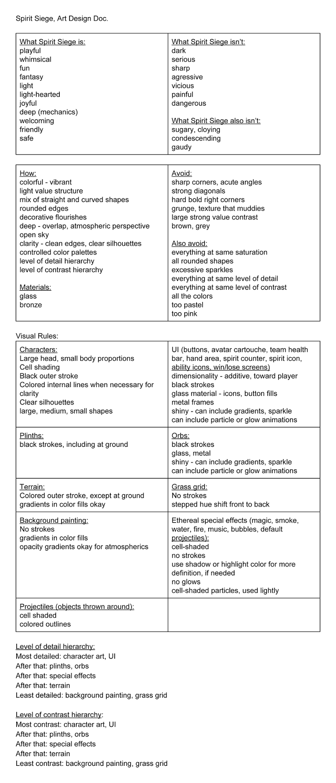 Another important part of the design process is defining the problem and naming solutions. This is how you know whether or not your reference actually supports the goals of the project. In reality, the two processes occur in tandem. Some design restrictions and goals are known from the outset, and others grow out of found inspiration and reference. I collected thoughts about Spirit Siege's new art direction and laid out art rules to support them in this art design document.
While doing an art direction pass this late in development is not ideal (we've thrown out an awful lot of work), in many ways it's easier than starting out in a void. For one thing, the gameplay is solid, stable, and fun. We already know what the mechanics are and how things will be arranged on the screen. We know what's important to the player when. Think of it as having a really well-tested greybox, that happens to not be grey.
For another thing, Caitlyn's character art style had undergone its own evolution by then and she'd really hit her stride delivering solid consistent appeal. Whatever the rest of the game might have become, it needed to support, enhance, and showcase those lovable characters.
In addition to the broad look & feel reference, I also found us specific reference for UI elements and a rendering style for the background. Meanwhile, Terry gathered her own reference for special effects animation and we worked together to find a compatible middle ground.


Next came sketches to explore the shape language of various UI elements. I did many of these while flipping through The Styles of Ornament, a Dover publication by Alexander Speltz and an excellent visual overview of decorative art history. Again, as creative as I am, it is a lot easier to conjure up new ideas when inspired by existing ones.


For the first mockup, I picked the teardrop UI shape, and ran with it just to have something there. Moving the horizon up in this background painting made the forced perspective less jarring, while the ocean vista still allowed the space to feel more open.
At this point, I was frustrated with the colors because I'd made a tactical error in choosing look & feel reference. The gameplay scene contains a lot of grass by necessity, so unless we were going to make the playing field distinct from its environment, that meant colors in the green spectrum. The reference, however, was dominated by blue/teal sky and water colors.

I had been trying emulate the awesome randomized-yet-gradient tile pattern from the reference on the game board, but we decided that it might confuse the player. Do lighter squares mean something different? Do they ever change color? A simple checker pattern would be easily understood and familiar enough to fade out of awareness. For a touch of atmospheric perspective, I kept a front-to-back gradient within the light and the dark greens.
In the next round, I brightened the colors even more, brought back team health bars, and revisited a different card design from the sketches.


Option 3 was the team's favorite. The winning card design wasn't as round and friendly-looking as the teardrop cards, so I incorporated more simple rounded shapes back into the UI elements and hand area border.
I had to fiddle around with it a bit to find the right balance of values and contrasts for the background painting. We needed it to be bright enough to lighten the overall look & feel, but not so bright or high contrast that it drew attention away from the important stuff happening in the game.
This was also when we added terrain back in, which seemed as good a time as any to address the scale problem. Previously, our terrain types had been:
- water - can shoot over, can't place on
- forest - can't shoot over, can place in
- mountains/rocks - can't shoot over, can't place on
I wanted to transfer those same functions into art on a human scale, so the team got together and did a brainstorming session for alternatives. After lots of whiteboard drawings, we were all fairly convinced that a fortress/bunker would be the best alternative to a forest (can't shoot over, can place in), but I'd mock up some tall grasses just in case. Turns out, we all liked the tall grasses more. A single tree was a pretty clean and undisputed alternative to mountains (can't shoot over, can't place on), and water stayed the same.

The next pass was polish, bringing in the shiny glass rendering style for buttons, the new spirit icon, and fleshing out the background painting.

With the broad strokes more or less settled, it was time to nail down a background color for the hand area. The favorites from Round 1 were carried over into Round 2.


The Spirit bottle icon wasn't quite working yet. We needed it to read clearly on the card, where it's obscured by the cost number, and be instantly associated with the Spirit counter above, where it stands alone. First we backed up and reconsidered other shapes. Orbs? Gems? Ultimately we stuck with the bottle.


Then we tried some different variations to find what would read the most clearly in both contexts.

To get to the image shown below, I shrunk the characters in the card frames so their silhouettes would read more clearly, rendered the final card back, and added in the dark blue countdown timers that tell the player when they'll be able to afford a card and when they'll be dealt their next card.

The last step was card frames that denote rarity. In our game, white is common, green is rare, blue is epic, and purple is mythic.

I hope you've enjoyed this glimpse into the creative process behind Spirit Siege's art style.
No comments:
Post a Comment