
Spirit Siege has a deck builder now! This screen was the first real opportunity to flesh out and nail down the visual language of menus, so lots of the problems we solved here will carry over into other parts of the game.
Here was the process:

At first, Terry made a wireframe based on some rough ideas that had been tossed around but not really solidified. Some of the features shown here turned out to be extraneous.

After more design discussions with the team, Terry made an awesome paper prototype with scotch tape and post-its. Yay! Craft time!

Next, the dev team made a greybox in engine. The card art had not yet been converted to the new style, but the old art served just fine for stand-in programmer art. Features that appear here that were not in the paper prototype: highlights around cards when you can't add more of that card to your deck (for one of two reasons), numbers on cards for how many of that card you have left in your collection (not in your deck), and below, numbers for how many of that card you have in your deck.

This was a very early crack at blocking in a mock-up in the new style. At this point, we were planning to scroll vertically through the card collection, in which case four across would simply be too dense; scrolling requires negative space between clickable things, and it would make us all sad to shrink Caitlyn's adorable character art down small enough to accommodate that.
I was also not satisfied with how dark these colors were coming out. My initial thought was to base the look and feel of menus entirely off the hand area of the gameplay scene, which looked like this:

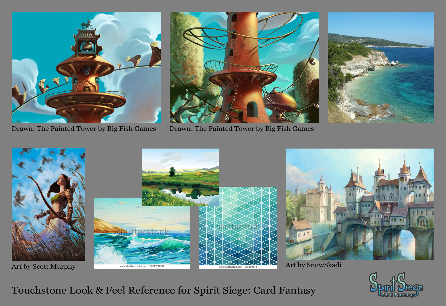
But then I went back to the touchstone look & feel reference (that's what it's for) and lightened things up accordingly.


Here we are, getting somewhat closer. The reference is light and atmospheric, so I swapped in gradients for color fills and eliminated the heavy metal bar separating the "Deck Building" title banner from the collection display area. Trying out purple and red-brown buttons was an attempt to preserve some of the feeling of the gameplay scene hand area by repeating colors, but that was not the right solution.

Next we switched to pages and tabs to navigate the card collection. The main thing this did for the art was create functional visual interest at the top of the page, an easy win over what was previously just a boring horizontal line. In this version, I also started adding functionality to communicate when you're out of a card, have maxed out the deck limit on a card, how many of each card you have left in your collection, and how many of each card you have in your deck.
Feedback I got from my team included:
- There should be some visual indicator all around the card if you can't place it in your deck. As is, your finger could easily obscure that information.
- Keyhole locked symbol is too much like Hearthstone's solution to this same problem.
- Green and light green highlight colors are too similar. Two values of the same hue suggests two degrees of the same reason for the same status, where the actual information we're trying to communicate is two different reasons (1. you've run out of that card in your collection or 2. you already have the maximum legal number of copies of that card in your deck) for the same status (you can't add this card to your deck).
- How many of each card you have in your deck is really important information. It should be more attention-grabbing.


I also thought the overall look & feel was a little lack-luster and flat, so I added depth and interest by layering in a copy of the background painting. Ahhh, much better.
Treating the bottom of the deck builder like the hand area of the gameplay scene finally satisfied my itch to make them match. The language this established was "my stuff is on red-brown at the bottom, neutral stuff is up top on green/blue." I consider cards you own but are not in your deck neutral enough to satisfy this condition. The same language will also be used in the pre-match screen, where choosing my opponent (human or AI?) will be against green up top, and choosing which of my decks to play with will be against red-brown at the bottom.

The final version includes some tweaks:
- Save, Clear, and Main buttons all their own colors, to make them more distinct from each other.
- Blue and purple highlights with white font to make cards you can't add to your deck more distinct from cards you can, and secondarily more distinct from each other.
- The addition of a ? button, to enable the player to revisit the deck building tutorial if they need help.
And that's the art side of creating the deck builder. As of the time of writing, most of these UI assets are in the game and we're in the process of polishing it up for Alpha release!
No comments:
Post a Comment