Wednesday, December 14, 2011

Mo'kai Character Sheet and Still Frame


The final character sheet offers a comparison between the original concept art and the 3D model.. Below is one of my favorite frames from the film. 


Mo'kai is running a time trial through an obstacle course as a right of passage. The film opens on him navigating the final stretch of a high-tech pipe gorge.  After nearly missing his leap over a deep chasm, he crosses the finish line and struts away victorious.

While the story is short and simple, this project was mostly about pulling off an entire film by myself. Character design, world building, and design documents were prepared ahead of time from a loose prompt. Then the remaining visual development, modeling, textures, rigging, animation, rendering and compositing were crammed into a single 14-week semester. Most of the work was done in 3DS Max, textures created in Photoshop, and compositing done with After Effects.

Art Deco Box Office


This is a paint-over of the low-poly Maya model to explore color, texture, mood, and lighting.

Why I chose this scene:
1. I love art deco. 
2. With another mild Seattle winter looming large in real life, I wanted to create a space where someone could hide out from the bitter cold of a real Midwestern winter while watching the pageant of snowflakes outside.
3. I wrote a character once who lived in 1930's Iowa and dreamed of being a Hollywood starlet. This space is for her. 


After several more iterations, here's how the final render came out.

Thursday, July 28, 2011

You Must Be This Tall to Ride


With this painting, I wanted to capture a feeling I had the summer I worked at a theater on Long Beach Island in New Jersey. As a popular tourist destination, the island was chalk full of fun things to do, shops to visit, and the a beach was never more than 2 blocks away. Unfortunately, the employees had little time off to enjoy it. I tried to capture the warm romantic spirit of sunset on the boardwalk and mix it with sadness and the longing to participate in revelries beyond one's grasp.  

Old Western Hotel


When I was a kid, I used to climb around on the rooftops of our house. It wasn't enough to explore the inside, I wanted to see how all the other spaces felt, too. Maybe that's why I play 3D platformers now.

I wanted the design of this building to spark that same need to explore. As I worked out the thumbnails, I was thinking: how would I get to the roof? What configuration of interior rooms and hallways would let me get to a particular door, window, or balcony? 

I was also thinking about the building's history. The little building was originally a flat-roofed single-story shack until its owner lost it to the hotel to settle his gambling debts. At first, the hotel just used it for storage. Some time later, when the hotel needed to expand, they added another floor, expanded the balcony, and converted those spaces into rooms.
Final building specs: 9,729 polygons, 3 texture sets at 1024x1024.


Friday, July 1, 2011

1960's Living Room


I had a lot of fun playing with the light and color in this illustration, especially when it came to playing the line work off the fill colors.

I wanted the props and decor to very clearly denote the time period, in all its quirkiness, while also giving some insight into the lives and story of the room's regular inhabitants.


Tuesday, June 28, 2011

Temple to the God of Effervescence


I was working under the prompt: Temple to the God of (fill in the blank). "Effervescence" made it on my brainstorm list after a host of more conventional deity elements, and the idea just stuck, strange as it was.

The two dictionary definitions are:
1. to bubble, hiss, and foam as gas escapes
2. to show liveliness or exhilaration

So I created a fantasy space which bubbled, hissed, and foamed, with waterfalls galore, and goblets of bubbly liquid, presumably with sacred significance. I also made it a place where visitors would be exhilarated. First, they'd need to climb up many narrow railing-less stairways to reach it, with the path winding behind the falling water, and then they'd have the opportunity to swim at the waterfall's edge or hang glide back down to the cliff base. Sounds pretty exhilarating to me. 

Part way through, I turned to James Gurney's Dinotopia illustrations for inspiration. 


Thursday, May 26, 2011

The Old Birch and the Young Maple


 I found these two trees at the Washington Park Arboretum. The birch was old, worn, scarred, gnarled, and awesome, complete with big black bird. The young Japanese maple was supple, light, airy and delicate. Whoever thinks trees don't have personalities isn't really looking.


Saturday, May 14, 2011

Mo'kai Discovers Eggs


I did this illustration of Mo'kai, the protagonist of my fall film project, as part of pre-production. He's a Gripus - a heavy earthy race who lives underground in a subtropical archipelago. Their main protein source are moa-like flightless birds, whose teal eggs are depicted above. The Maori people of New Zealand were my main inspiration for the Gripus culture.

Wednesday, April 27, 2011

A Lark in the Park

I lucked out this year with the most awesome film team. Marc Thompson animated the blue bookworm, and Jon Gardner animated the big guy with the butterfly net. They were a joy to work with. While none of us have any strong ambitions to do hand-drawn animation for a living, our project still came out pretty well.


We were given a limited set of character designs to chose from, and the beginning of a scenario: one character is wooing another, and the third gets in the way. How, where, and why any of that happens was up to the team to decide. All the frames were drawn by hand, scanned, and then colored in Toon Boom. I animated the purple woman and painted the background in Photoshop.

Monday, April 25, 2011

Will Fain Model


Well, here's how my first human in 3DS Max came out. A lot of learning happened, that's for sure.

Sunday, April 10, 2011

Phorbas of Argos, Armored Satyr


The idea here was that the creatures of Greek myth stuck around and were simply incorporated into the societies which developed in the Mediterranean after the fall of Rome. I placed this guy roughly in the period of the early Crusades, which gave me some liberty to mix and match periods of armor. He's a mercenary with a collection of pieces picked up along his journeys. 


When it came to the animal anatomy, the biggest challenge was getting the right mechanic without making him look dainty and unstable. He's supposed to be a warrior, after all. For that, I looked at the chunky hoofs of Clydesdales and beefed up the leg muscles accordingly.  


Saturday, March 19, 2011

Polly Watson


My inspiration for Polly was the golden era of movie musicals, specifically a book I'd been reading about the backstage culture on the sets. As opposed to the typically quiet and good-natured backup dancers, "the knitters," whose body shapes and measurements are all uniform within a very specific range, Polly is a leading lady, and her forms are more extreme and exaggerated. As soon as she walks into a room, you can tell that she'd never fit in with the chorus line. Despite her talents as a dancer, her career will not last long because of her spoiled diva attitude, racy costume choices (Bare navel! In the 1930's! Scandal!) and tumultuous attempts to seduce the film's producer. 

Sunday, February 13, 2011

Will Fain Concept Art


This is the concept art for my first human character to be modeled in 3DS Max. The face and proportions are modeled after my friend Will, and the character design was inspired by the story and world-building of Janelle MonĂ¡e's albums, The ArchAndroid and Metropolis. It is a retro-future in which it is possible for an android to be persecuted for falling in love with a human. While I didn't invent the concept of an electro-dagger, it was fun to imagine what one would look like.  

Friday, February 11, 2011

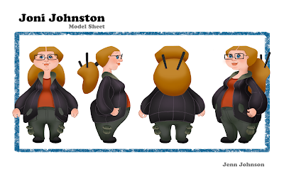
Character Design of Joni Johnston


This character design is based off a good friend of mine. I wanted to play with proportions and shapes while clearly expressing her personality and style.